
Helping users earn yield with confidence
Project type: 0 to 1 • My role: Product Design • Timeline: 2 months
Task: Launch Staking
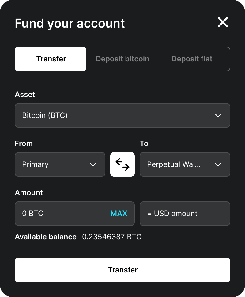
Build Gemini's first staking experience into the existing Earn product, on an accelerated timeline.
Problem: Comprehension Gap
Users didn't understand what staking was, where the yield came from, or how it differed from Earn.
Team:
1 Product Designer, 2 Product Managers,
2 Engineers
Note: I left the company four months before launch and can't speak to how the product performed.
Solution: An Educational Path
I designed a flow offering users a path to learn before staking, without forcing it, alongside a direct route for those who already understood.
Gemini is a crypto company focused on unlocking the next generation of financial freedom.
CONTEXT
Staking extends that mission by giving users a way to earn yield directly from the blockchain, not through a third party.
Most users couldn't explain what staking actually was, or why it paid so much more than Earn.
PROBLEM
I was asked to add staking to the existing Earn experience on a two-month timeline. Before designing anything, I flagged a real risk: users conflated Earn (a third-party lending product) with Staking (a blockchain-native process), with no way to judge whether the high yield was safe.
No clear understanding of where staking yield came from
No way to distinguish staking's risk from Earn's
I convinced product management to invest time in comprehension testing with 10 users, evaluating whether they understood staking, where its yield came from, and how it differed from Earn.
PROCESS / KEY INSIGHTS
KEY INSIGHT #1
Most users could correctly explain Earn, comparing it to a high-yield savings account, but 7 of 10 could not explain what staking was or where its yield actually came from.
KEY INSIGHT #2
Users misread the products' risk. Several expected "higher rate means higher risk," while others assumed the opposite: that a rate this good must have a catch. One user asked why, if staking was this easy, "wouldn't everyone do it?"
KEY INSIGHT #3
Not everyone needed convincing. Some users already understood how staking worked and wanted to move fast, while novices needed real explanation before trusting the product. One flow couldn't serve both.
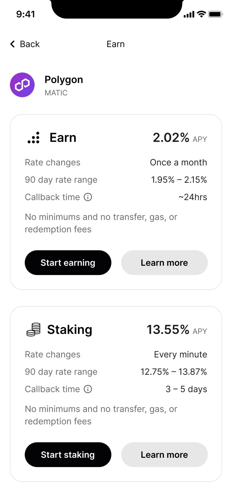
Earn and Staking, side-by-side, with the facts that actually mattered.
Users couldn't judge risk without basic facts in front of them. Rate, callback time, and how often rates changed all sat side-by-side, turning an abstract comparison into a concrete one.
DESIGN 1/3
DESIGN 2/3
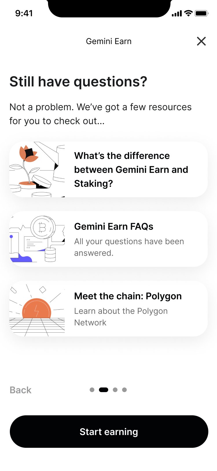
The FAQ resource screen gives users a direct answer to the exact question the research uncovered: what's the difference between Earn and Staking.
Comprehension didn't need to block the flow. Users who wanted to learn could, without forcing every user through an explainer they didn't need.
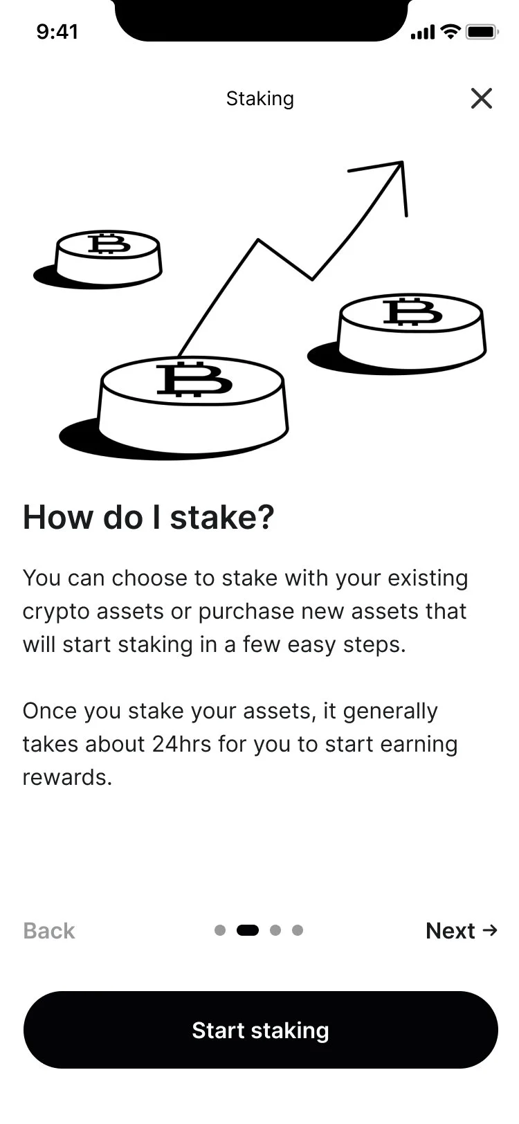
The staking carousel walks users through how staking works and what to expect before they commit.
For users who needed real explanation, this replaced a wall of legal text with a short, guided path, answering "how do I stake?" before asking them to.
DESIGN 3/3
Never tested the real question. We solved for comprehension, but never got to research what actually drives someone to chase 13% yield over a safer, insured savings account.
Never saw it ship. I was let go in a company-wide layoff before launch.
Made the case for slowing down. Leadership wanted staking out fast, even if rough. I argued a confusing launch loses the value of launching at all, and the extra research time paid for itself in fewer support tickets and fewer users lost to a product they didn't understand.
RETROSPECTIVE